3 Key Tools for an Effective HubSpot Lead Management System
Successful lead management requires a clean database with actionable information that fits into your overall sales and marketing blueprint. That’s...

Picture this: You've spent hours working on that piece of advanced content or perfect set of lead nurturing emails, created a beautiful CTA, and brainstormed the perfect copy for the landing page. You quickly add a form, click "Publish," and wait for the leads to roll in. Unfortunately, they don't.
What gives?
Before you scrap everything, give your form a once-over. It may not seem as important as content that resonates or mobile-friendly templates, but your form can make or break your conversion rate. Here are seven rules that highly effective lead forms usually follow:
A good rule of thumb when it comes to fields is to stick between three and five. However, here's the tricky part – every single offer "requires" a different number of form fields. If you're offering a monthly newsletter, it might be best to stick with a required email and an optional first name. If you're offering a free quote for your services, you'll likely need a lot more information. What you definitely don't want to do, however, is require a lot of form fields for a small payout.
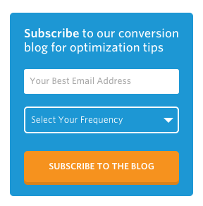
Unbounce is a great example. If you'd like to subscribe to the Unbounce blog, they only require you fill out two fields. Not only that, but the information they request is relevant to the offer – they'll need your email address to deliver the blogs, but they also give you the power to select how many emails from them you'll receive. This is how you get conversions.
Your "submit" button is the very last hurdle your visitor must jump before converting. To keep them engaged, make it more exciting and more persuasive than the word "Submit." This is also a great way to let the visitor know what will happen next – using a verb like "Download" or "Access" is a gentle way to remind the visitor that he or she is getting something out of the conversion. Some of the best forms, though, use the Submit button to remind the visitor why they wanted the offer in the first place. Haskell's Wine and Spirits, a Minneapolis-based family business, recently put together a recipe book that featured old family recipes, stories, and pictures, along with great wine recommendations to go with. Here's the form on the landing page:
"Let's get cooking!" is a lot more enticing than "Submit" or "Download," right? Right. It reminds the visitor that once they download the recipe book, they will be able to make something absolutely delicious for dinner. And who doesn't love good food? (Side note – is anyone else suddenly hungry?)
As marketers, we know that most people aren't comfortable giving out a lot of personal information on the internet. What constitutes as personal, however, may surprise you. If you ask for or require personal information that doesn't seem to relate to your offer, it can lower your conversion rate. If your offer is a blog subscription, even requiring something like a last name might be too much. Here's a form from The Sales Lion that offers an introductory-level Inbound Marketing eBook:
Notice how the "Company Name" isn't required? It may seem too personal for someone who is downloading an introductory-level eBook. It's possible that the visitor is thinking of making a lateral career move, or is looking for information for their side business, and doesn't want to give their company's name. There are a lot of different reasons that someone may download an introductory-level eBook, and requiring a lot of information may make them run for the hills.
Here is a form for a different eBook offer from the same company. This one shares information on how to create a culture of inbound marketing within your staff. The motive to download this eBook is a lot less broad than an introductory-level book, which means that you can ask for a lot more information without driving your visitor away:
Since the Sales Lion also offers workshops to companies, they likely use this information to determine whether or not the visitor might benefit from an in-person workshop, as well.
In other words, asking for information that your visitor doesn't think is necessary is a great way to look dishonest. Try to distinguish between the lead information you want and the lead information you need, and don't go overboard.
Make sure that your form stands out on the page. Try to choose a contrasting color, and make sure your form has room on the page to breathe. 
This form appears on the Unbounce blog exactly as you see it here – a blue form on a white background. The contrast is vivid, your eye is drawn to the orange Submit button, and they've used their brand colors. Perfect.
Looking to try out HubSpot for a bit? Here's what you'll see when you click on their "Start Your Free Trial" button:
You can scroll down to find much more information on what the free offer entails, but they've made sure the form is visible above the fold. This is important because some people will come to your landing page knowing that they want what you're offering – and they're looking to "Submit." The harder it is to find your form, the more likely they are to bail. If someone doesn't need much time to decide that they want your offer, don't give them the time to change their mind. Offering secondary information is a great idea, but add it below the fold.
This is especially important if the form asks for personal information – things like home address, personal cell phone number, credit card information, etc. For example, Mint is a company that tracks all of your bank accounts, credit cards, and helps you budget.
Notice that they've included their Privacy Policy not once, but twice – important, because Mint is about to ask for some very personal information. One quick thing to know is that you want to avoid using the word "spam" anywhere near your form – that specific word has a tendency to decrease your conversion rate. Yep, telling people you won't send them spam actually makes them worry about spam. So don't!
Basecamp, an online project management tool, does a great job of demonstrating social proof. Nobody wants to be the only person who fell for a scam, and social proof is a great way to instill trust in your visitor.
If 7,177 companies signed up to use Basecamp last week alone, it's probably worth your time to try it out. Right? In fact, won't you feel foolish if you miss out? That's the power of social proof.
After all is said and done, remember that these "rules" are a little more like guidelines. Be sure to use your best judgment, and keep in mind that content is still king. If your offer doesn't resonate with your audience, the form isn't going to convert.

Successful lead management requires a clean database with actionable information that fits into your overall sales and marketing blueprint. That’s...

When it comes to inbound marketing, content is king. Inbound marketing is driven by the belief that every company has valuable content for any...

Generating new, qualified leads is crucial for sustaining and growing revenue. In the constantly changing world of digital marketing, your website...